PEARL VII :
The metrics for measuring software quality in an agile environment are drastically different from that of those used in traditional IT landscapes. How to effectively measure Agile S/w development Quality in Agile Enterprise using Agile Metrics is dealt here.
Agile software development grew in part from the intersection of erstwhile alternative practices that predated it. And even more derivatives had sprung up throughout the years. This had led to the evolution of Agile in its current state. Wherein, all the defined practices becomes a catalog from which development teams could choose from, and adapt what is appropriate for their case. This evolution then leads to the fact that development teams will not easily have uniform processes. Forcing uniformity will most likely negate the benefits of Agile. That said, most metrics are intimately tied to actual practices, but measurements should be able to cope with this perceived variability
The traditional metrics are also in conflict with agile’s and lean’s principles. For example, a focus on adherence to estimates is incompatible with agile’s principle of embracing change. It will lead to chasing obstacles, instead of seizing opportunities.
In Agile Management for Software Engineering: Applying the Theory of Constraints for Business Results, David Anderson combines TOC with Agile software development, with the objective of creating a process that “scales in scope and discipline to be acceptable in the boardrooms of the Fortune 1000″ . Anderson compares traditional “waterfall”, FDD, XP and RAD approaches, and proposes a rigorous metrics approach.
Anderson provides a convincing argument for the traditional metrics inability to measure agile software development . By demonstrating how they violate Reinertsen’s criteria for a good metric. Traditional metrics do not meet the criterion of being relevant, because of the high cost focus. The cost should not be the main concern. Moreover, they elude the requirements of being simple and easy to collect. For example, the once popular traditional metric to count the lines of code has no simple correlation with the actual effort. The software complexity results in a nonlinear function between the effort and the lines of code. It also motivate to squeeze in
It is impossible to create a metric set that would suit all agile projects. Every project has different goals and needs, and, as the incremental and emergent nature of agile methods
[Mnkandla and28 Dwolatzky, 2007] implies that metrics – as part of the framework of development technologies – should also be allowed to emerge. There are, however, methods for choosing suitable metrics.
When measuring the production side of the development it is important to select metrics that support and reflect the financial counterparts. The most commonly recommended agile production metrics, which are described in the following sections.
Total project duration: Agile projects get done quicker than traditional projects. By starting development sooner and cutting out bloatware — unnecessary requirements — agile project teams can deliver products quicker. Measure total project duration to help demonstrate efficiency
Time to market: Time to market is the amount of time an agile project takes to provide value, either through internal use or by generating income, by releasing working products and features to users.
Time to market is especially important for companies with revenue-generating products, because it aids in budgeting throughout the year. It’s also very important if you have a self-funding project— a project being paid for by the income from the product.
Total project cost: Cost on agile projects is directly related to duration. Because agile projects are faster than traditional projects, they can also cost less. Organizations can use project cost metrics to plan budgets, determine return on investment, and know when to exercise capital redeployment.
Return on investment: Return on investment (ROI) is income generated by the product, less project costs: money in versus money out. On agile projects, ROI is fundamentally different than it is on traditional projects. Agile projects have the potential to generate income with the very first release and can increase revenue with each new release.
New requests within ROI budgets: Agile projects’ ability to quickly generate high ROI provides organizations with a unique way to fund additional product development. New product features may translate to higher product income. If a project is already generating income, it can make sense for an organization to roll that income back into new development and see higher revenue.
Capital redeployment: On an agile project, when the cost of future development is higher than the value of that future development, it’s time for the project to end. The organization may then use the remaining budget from the old project to start a new, more valuable project.
Team member turnover: Agile projects tend to have higher morale. One way of quantifying morale is by measuring turnover through a couple metrics:
-
Scrum team turnover: Low scrum team turnover can be one sign of a healthy team environment. High scrum team turnover can indicate problems with the project, the organization, the work, individual scrum team members, burnout, ineffective product owners forcing development team commitments, personality incompatibility, a scrum master who fails to remove impediments, or overall team dynamics.
-
Company turnover: High company turnover, even if it doesn’t include the scrum team, can affect morale and effectiveness. High company turnover can be a sign of problems within the organization. As a company adopts agile practices, it may see turnover decrease.
Requirements and design quantification
Tom Gilb strongly believes that quantification of requirements is an essential concept missing from the agile paradigm, or even from software engineering in general. He claims that this lack is a risk for project failure, as software engineers and project managers cannot properly manage project results, control risks and costs, or prioritize tasks [Gilb and Cockburn, 2008]. Especially important are quality characteristics, because “functions and use cases are far less interesting” [Gilb and Cockburn, 2008] and “that is where most people have problems with quantification” [Gilb and Brodie, 2007]. Gilb assures that only numerically expressed quality goals are clear enough and therefore quantification is a step needed on the way from high level requirements to design ideas.
Design ideas also should be quantified [Gilb and Brodie, 2007]. It is done by the estimation of their value (to the customer – business value, not technical) and cost (effort). Then it is possible to identify the best designs – the ones with the highest value-to-cost ratio – and reprioritize the following development steps. A similar idea is described by Kile and Inampudi [2007]. The value and cost for implementing a requirement is estimated (without considering different design ideas) and the requirements are prioritized according to the result. This was a solution to a problem with the requirements prioritization ability of the customer and the development team. With some requirements having high value and high cost, and others having moderate value but very low cost, it was not easy to compare their desirability without quantification.
Metrics can also aid the application of agile practices. For example, in refactoring they can give information on the appropriate time for and the significance of a refactoring step [Kunz et al., 2008].
Heuristics for wise agile measurement [Hartmann and Dymond, 2006]
A good metric or diagnostic:
- Affirms and reinforces Lean and Agile principles.
- Measures outcome, not output.
- Follows trends, not numbers.
- Belongs to a small set of metrics and diagnostics.
- Is easy to collect.
- Reveals, rather than conceals, its context and significant variables.
- Provides fuel for meaningful conversation.
- Provides feedback on a frequent and regular basis.
- May measure Value (Product) or Process.
- Encourages “good-enough” quality.
Leffingwell argues that measurement should happen during iteration retrospectives and release retrospectives.
He proposes two categories of metrics: quantitative and qualitative. Quantitative metrics for an iteration consist of process metrics, such as the number of user stories accepted / rejected / rescheduled / added, and product metrics related to quality (defect count) and testing (number of test cases, percentage of automated test cases, unit test coverage).
Quantitative metrics for a release measure the release progress with value delivery (number of features delivered to the customer and their total value expressed in feature points, feature debt – existing customer commitments), conformance to release date, and technical debt (number of refactoring targets and number of refactorings completed, also called architectural debt or design debt). The qualitative assessment for both iteration and release requires listing what went well and what did not, revealing what should be continued and what needs to be improved.
Kunz et al. [2008] propose to combine software measurement with refactoring in order to indicate when a refactoring step is necessary, how important it is, how it affects quality, and what side effects it has. Metrics would be used here as triggers for needed refactoring steps.
Categories of Metrics
Quality
- Defect Count
- Technical Debt
- Faults-Slip-Through
- Sprint Goal success rate
Predictability
- Velocity
- Running Automated Tests
Value
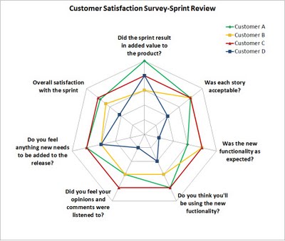
- Customer Satisfaction Survey
- Business Value Delivered
Lean
- Lead Time
- Work In Progress
- Queues
Cost
- Average Cost Per Functions
Commonly recommended agile production metrics.
Lean Metrics
The selection of production metrics must carefully consider what has been advised in the previous sections. Inventory based metrics possess all these characteristics and give the advantage of addressing the importance of flow, The most significant inventory based metrics are summarized below
Lead time – Relates to the financial metric Throughput. The lead time should be as short and stable as possible. It reduces the risk that the requirements become outdated and provides predictability. The metric is supported by Poppendieck, who states that the most important to measure is the ―concept-to-cash -time together with financial metrics .
Queues – In software development queue time is a large part of the lead time. In contrast to the lead time, queue metrics are leading indicators. Large queues indicate that the future lead time will be long, which enables preventive actions. By calculating the cost of delay of the items in the queues, precedence can be given to the most urgent ones.
Work in Progress – Constraining the WIP in different phases is one of the best ways to prevent large queues. If used in combination with queue metrics, WIP constraints prevent dysfunctional behavior such as simply renaming the objects in queues to work in progress. The metric is also an indicator of how well the team collaborates . A low WIP shows that the team works together on the same tasks. In addition, the Kanban method, which is built around the idea of constraining the WIP promises that it will result in an overall better software development,
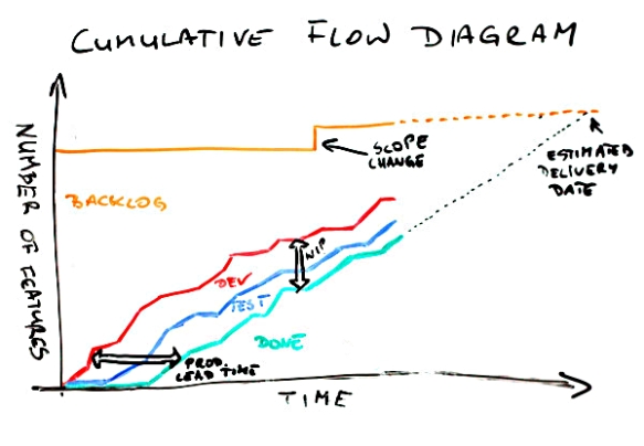
These metrics can be visualized in a cumulative flow diagram, By tracking the investment’s way along the value chain towards becoming throughput, the inventory based metrics correlates well with the financial metric Investment.
Cost Metrics
Anderson argues the only cost metric needed is Average Cost Per Function (ACPF) and should only be used to estimate future operation expenses
Business Value Metrics
Agile software development puts the focus on the delivery of business value. Methods such as Scrum prioritize the work by value, making it sensible to measure the business value. It has also been observed that the trend in the industry is to measure value .
Hartmann notes that agile methods encourage the development to be responsible for delivering value rapidly and that the core metric should oversee this accountability. The quick delivery of value means that the investment is converted into value producing software as soon as possible. Leading metrics of business value includes estimations and is not an exact science.
Mike Cohn offers a possible solution to measure the business value , which involves dividing the business case’s value between the tasks. The delivery of value can be displayed in a Business Value Burnup Chart, One way to verify the delivery of business value, is to ask the customer if the features are actually used . It has proved useful to survey the customer over the time of a release and is much in line with the agile principle of customer cooperation.
Quality Metrics
Lean metrics can indicate the products’ quality and provide predictability. For example, large queues in the implementation phase indicate poor quality and a stable lead time contributes to predictability. However, it might be necessary to supplement and balance them with more specific metrics.
A quality metric recommended by the agile community is Technical Debt .
Technical debt is a metaphor referring to the consequences of taking shortcuts in the software development. For example, code written in haste that is in need of refactoring. The debt can be represented in financial figures, which makes the metric suitable to communicate to upper management .
Technical metric measures the team’s overall technical indebtedness; known problems and issues being delivered at the end of the sprint. This is usually counted using bugs but could also be deliverables such as training material, user documentation, delivery media, and other
Counting defects in individual iterations can have a fairly large variation and may paint a misleading picture . Another aspect of defects is where they have been introduced. The fault-slips-through metric measures the test efficiency by where the defects should have been found and where it actually was . It monitors how well the test process works and addresses the cost savings of finding defects early. In case studies on implementation of lean metrics, the faults-slip-through has been recommended as the quality metric of choice
The primary purpose of measuring Faults Slip Through is to make sure that the test process finds the right faults in the right phase, i.e. commonly earlier. Fault Slip Through represents the number of faults not detected in a certain activity. These faults have instead been detected in a later activity
Sprint goal success rates: A successful sprint should have a working product feature that fulfills the sprint goals and meets the scrum team’s definition of done: developed, tested, integrated, and documented.
Throughout the project, the scrum team can track how frequently it succeeds in reaching the sprint goals and use success rates to see whether the team is maturing or needs to correct its course.
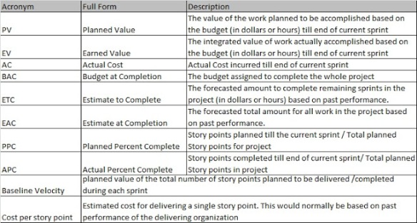
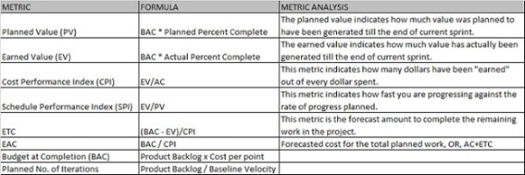
EVM Metrics
Predictability Metrics
What many organizations hope to gain from the measurement is predictability . In several of the agile methods the velocity of delivered requirements is used to achieve predictability and estimate the delivery capacity. The average velocity can serve as a good predictability metric, but can easily be gamed if used for other purposes. For example, Velocity used to measure productivity can degrade the quality.
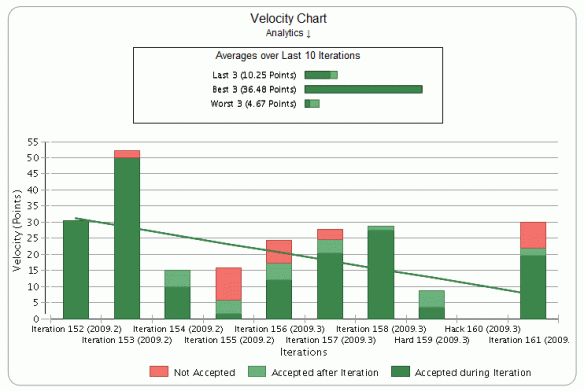
Velocity is a capacity planning tool sometimes used in Agile software development. Velocity tracking is the act of measuring said velocity. The velocity is calculated by counting the number of units of work completed in a certain interval, the length of which is determined at the start of the project
The main idea behind velocity is to help teams estimate how much work they can complete in a given time period based on how quickly similar work was previously completed.
The following terminology is used in velocity tracking.
- Unit of work
- The unit chosen by the team to measure velocity. This can either be a real unit like hours or days or an abstract unit like story points or ideal days. Each task in the software development process should then be valued in terms of the chosen unit.
- Interval
- The interval is the duration of each iteration in the software development process for which the velocity is measured. The length of an interval is determined by the team. Most often, the interval is a week, but it can be as long as a month.
To calculate velocity, a team first has to determine how many units of work each task is worth and the length of each interval. During development, the team has to keep track of completed tasks and, at the end of the interval, count the number of units of work completed during the interval. The team then writes down the calculated velocity in a chart or on a graph.
The first week provides little value, but is essential to provide a basis for comparison.Each week after that, the velocity tracking will provide better information as the team provides better estimates and becomes more used to the methodology.
The Velocity Chart shows the amount of value delivered in each sprint, enabling you to predict the amount of work the team can get done in future sprints. It is useful during your sprint planning meetings, to help you decide how much work you can feasibly commit to.
You can estimate your team’s velocity based on the total Estimate (for all completed stories) for each recent sprint. This isn’t an exact science — looking at several sprints will help you to get a feel for the trend. For each sprint, the Velocity Chart shows the sum of the Estimates for complete and incomplete stories. Estimates can be based on story points, business value, hours, issue count, or any numeric field of your choice . Please note that the values for each issue are recorded at the time the sprint is started.
Running Automated Tests measures the productivity by the size of the product . It counts test points defined as each step in every running automated test. The belief is that the number of tests written is better in proportion to the requirement’s size, than the traditional lines-of-code metric. The metric addresses the risk of neglected testing, which is usually associated with productivity metrics. It motivates to write tests and to design smaller, more adaptive tests. Moreover, it has proven to be a good indicator of the complexity and to some extent on the quality . For measuring release predictability, Dean Leffingwell proposes to measure the projected value of each feature relative to the actual . However, the goal should not be to achieve total adherence. Instead, the objective should be to stay within a range of compliance to plan, which allows for both predictability and capturing of opportunities.
Actual Stories Completed vs. Committed Stories
The measure is taken by comparing the number of stories committed to in sprint planning and the number of stories identified in the sprint review as completed.
Visualization
To get the full value of agile measurement, the metrics need to be acted upon. The visualization of the metrics helps to ensure that actions are taken and achieves transparency in the organization . The company’s strategies become communicated and the coordination increases.
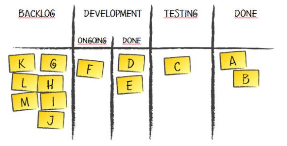
In Kanban the visualization of the workflow is an important activity and facilitates self-organizational behavior . For example, when a bottleneck is shown the employees tend to work together to elevate the bottleneck. Both Kanban and Scrum use card walls to visualize the work flow where each card represents a task and its current location in the value chain. The inventory based metrics can then be collected using the card walls. A very effective way to visualize the inventory based metrics is cumulative flow diagrams .
The cumulative flow diagram is an area graph, which shows the workflow on a daily basis.
Cumulative Flow Diagram
Are you a manager or business stakeholder working on an Agile points are the unit of measure used by this team for estimation Scrum Project and facing the following issues?
You have a strong feeling that there are bottlenecks in the process but are facing a lot of difficulty in mapping it to the process.
You are not satisfied with the burn-up and burn-down charts produced by the team and are interested in getting more insight into the process.
There is a panacea to solve all of the above issues. The name of the magic potion is “cumulative flow diagram”. Cumulative flow diagrams (CFDs) applied on top of the basic principles of KAN (visual) + Ban (card) can give you an insight into the project and keep everyone updated. CFD can be an extremely powerful tool when applied to a Scrum model.
A Cumulative Flow Diagram (CFD) is an area chart that shows the various statuses of work items for a product, version, or sprint. The horizontal x-axis in a CFD indicates time, and the vertical y-axis indicates cards (issues). Each coloured area of the chart equates to a workflow status (i.e. a column on your board).
A CFD can be useful for identifying bottlenecks. If your chart contains an area that is widening vertically over time, the column that equates to the widening area will generally be a bottleneck.
Multi-color CFDS look complicated but pretty. The pain of understanding it is worth the gain you get from it. These diagrams can help you in making critical business decisions. They will help give you better visibility regarding the time to market dates for features. Applying it on top of a Scrum project will help you see an accurate picture of the progress on your project.
Giving CFD to this team will help them in following the “Inspect and Adapt” Scrum principle. They can further zoom into the work in progress to see various flow states. CFD will help you in analyzing the actual progress and bottlenecks in any project. CFD can be drawn using area charts in MS Excel.
There are many other usages of CFDs besides finding bottlenecks. CFDs are multi-utility graphs that continuously report the true status of an Agile project. CFDs can help in determining lead time, cycle time, size of backlog, WIP, and bottlenecks at any point in time
Lead time is the time from when the feature entered backlog to its completion status. This is of utmost interest to business stakeholders. It can help business people decide about the time to market for features. They can plan marketing campaigns based on lead times.
Cycle time is the time taken by team from when they started work on it to completion status. This helps the project leads make important decisions in selecting items for working.
WIP is the work currently lying in different stages of the software lifecycle. Cycle time is directly proportional to the work in progress items. Keeping a limit on WIP is a key to success in any Agile project. In Scrum we try to limit the WIP within a sprint, but limiting
it across the various flow states will help further in gaining better control and visibility in a sprint.
Controlling WIP is the mantra for victory in any project. With CFDs, WIP is no longer a black box and anyone can see the work distribution at any point in time. Thus CFDs provide better insight and the power for better governance in any Agile methodology.A single diagram can contain information about lead time, WIP, queues and bottlenecks.
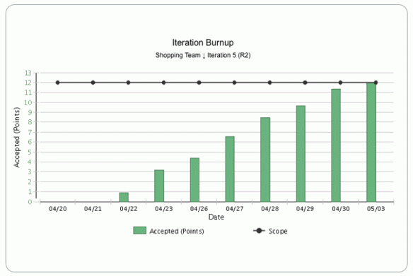
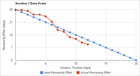
In Scrum, the Burndown Chart is a standard artifact. It allows the teams to monitor its progress and trends. The Burndown Chart tracks completed stories and the estimated remaining work. There are also variations of the Burndown Chart . For example, the Burnup Chart contains information about scope changes. For even better predictability, story points may be used. The stories are assigned points by the estimated effort to implement them.
A Burndown Chart shows the actual and estimated amount of work to be done in a sprint. The horizontal x-axis in a Burndown Chart indicates time, and the vertical y-axis indicates cards (issues).
Use a Burndown Chart to track the total work remaining and to project the likelihood of achieving the sprint goal. By tracking the remaining work throughout the iteration, a team can manage its progress and respond accordingly.
To communicate the KPIs, many organizations use Balanced Scorecards or Dashboards Dashboards are used to effectively monitor, analyze and manage the organization’s performance . The level of detail of the dashboards varies, ranging from graphical high-level KPIs to low-level data for root cause analysis. In order to communicate and facilitate that metrics are acted upon the measurement practice should: Visualize the metrics to achieve transparency. Be careful to not create dysfunctional behavior with the visualization.
Continuous Improvement
Kaizen is the Japanese word for continuous improvement and is a part of the lean software development . It is also found in agile software development. For example, Scrum has retrospectives after each sprint where improvements are identified. The retrospectives have similarities to Deming’s Plan-Do- Check-Act (PDCA) .
The PDCA is a cycle of four phases, which should drive the continuous improvement. What is notable is that the PDCA prescribe measurement to verify that improvements are achieved. Petri Heiramo observes that the retrospectives lack measurements and argues that it can lead to undesirable results . Without any metrics, it will be difficult to determine whether any targets have been met. This in turn can be demoralizing for the commitment to the improvement efforts.
Heiramo, suggest that these three questions should be added to the retrospective: What benefit or outcome do we expect out of this improvement/change? How do we measure it? Who is responsible for measuring it? Diagnostics can be used to obtain these measurements, In order for the diagnostics to achieve process improvement, the measurement practice should Be an integrated part of a process improvement framework.
Agile Metrics at MAMDAS – a software development unit in the Israeli Air Force
MAMDAS – a software development unit in the Israeli Air Force develops large scale , enterprise critical applications for Israeli Airforce. The project is developed by a team of 60 skilled developers and testers, organized in a hierarchical structure of small groups.
The project develops large-scale, enterprise-critical software, intended to be used by a large and varied user population. During December 2004, the first XP team was established for MAMDAS to implement XP . It was encouraging to observe that after the first two weeks iteration “managers were very surprised to see something running” and everyone agreed that “the pressure to deliver every two weeks leads to amazing results” Still, accurate metrics are required in order to take professional decisions, to analyze long-term effects, and to increase confidence of all management levels with respect to the process that XP inspires.
They described four metrics and the kinds of data that are gathered to calculate them. These four metrics present information about the amount and quality of work that is performed, about the pace of the work progresses, and about the status of the remaining
work versus remaining human resources.
Product size, initially just called ‘Product’, is the first metrics. It aims at presenting the amount of completed work. The data that was selected to reflect the amount of work is the number of test points. One test point is defined as one test step in an automatic acceptance testing scenario or as one line of unit tests. The number of test points is calculated for all kinds of written test and is gathered per iteration per component. Additional information is gathered with respect to the number of test points for tests that pass, the number of points for tests that fail, and the number of points for tests that do not run at all.
Pulse is the second metrics, which aims to measure how continuous the integration is. The data is automatically gathered from the development environment by counting how many check-in operations occur per day. The data is gathered for code check-ins, automatic-test check-ins, and detailed specifications check-ins. When referring to code it means code plus its unit test.
Burn-down is the third metrics. It presents the project remaining work versus the remaining human resources. This metrics is supported by the main planning table that is updated for each task according to kinds of activities (code, tests, or detailed specifications), dates of opening and closing, estimate and real time of development and, the component that it belongs to. In addition, this metrics is supported with the human resources table that is updated when new information regarding teammates’ absence arrives. This table also contains the product’s component assigned to each of the teammates and with the percentages of her/his position in the project. By using the data of these tables, this metrics can present the remaining work in days versus the remaining human resources in days. This information can be presented per week or for any group of weeks till a complete release, both for the entire team or for any specific component.
The burn-down graph answers a very basic managerial question: are we going to meet the goals of this release, and if not, what can we do about it? Release goals were set before each release – each goal is a high-level feature. Goals are defined by the user, and are verified by matching a rough estimate of the effort required to complete each goal (given by the development team) to the total available resources.
Once goals are defined and estimated, both remaining work and remaining resources are based on this initial estimation, which is refined as the release progresses.
Faults is the fourth metrics, which counts faults per iteration. During the release on which all faults that were discovered in a specific iteration were fixed at the beginning of the next iteration. The faults metrics is required to continuously metrics the product’s quality. Note that the product size metrics doesn’t do it, since although it metrics test points, it does not correlate between the number of failed or un-run test steps to the number of actual bugs.The feedback on the Size Metrics was that it motivates writing tests and that it can be referred also as complexity metrics.
The use of the presented metrics mechanism increases confidence of the team members as well of the unit’s management with respect to using agile methods.Further, these metrics enable an accurate and professional decision making process for both short- and long-term purposes.
Technical Debt in Petrobras , Brazil
As an oil and gas company, Petrobras (http://www.petrobras.com.br) develops software in areas which demands increasingly innovative solutions in short time intervals. The company started officially with Scrum in March of 2009, using its lightweight framework to create collaborative self-organizing teams that could effectively deliver products. After the first team had adopted Scrum with a relative success, the manager noticed that the framework could be used in other teams, and thus he invested in training and coaching so that the teams could also have the opportunity to try the methodology. At that time, only the software development department for E&P, whose software helps to Exploit and Produce oil and gas, had management endorsement in adopting scrum and agile practices that would let teams deliver better products faster. About one year and half later, all teams in the department were using Scrum as its software development process. The developers and the stakeholders in general noticed expressive gains with the adoption of Scrum.
The results had varied from the skill of the team leadership in agile methodologies, customer participation, level of collaboration between team members, technical expertise among other factors.
The architecture team of the software development department for E&P was composed of four employees, whose responsibility was to help teams and offer support for resolution of problems related to agile methods and architecture. At that time, it had to work with 25 teams which had autonomy regarding its technical decisions. In fact, autonomy was one of the main managerial concerns when adopting agile methods.
After Scrum adoption, there was active debate, training and architectural meetings about whether Agile engineering practices should also be adopted in parallel with managerial practices; in hindsight, it would have accelerated the benefits had they been adopted. But the constraints of time and budget, decisions made by non- technical staff, and the bureaucracy in areas such as infrastructure and database, led to the postponement of those efforts initially. Moreover, the infrastructure area had only build and continuous integration (CI) tools available. And, unfortunately, these tools were not taken seriously by the teams. The automated deployment was relatively new and was postponed because of fear of implementing it in immature phase. Other tools and monitoring mechanisms were not used by the teams even so the architecture team was aware of its possible benefits.
Despite all initiatives in training and supporting in agile practices such as configuration management, automated tests and code analysis, teams, represented by 25 focal points in architectural meetings, did not show much interest in adopting many agile practices – particularly technical practices. Delivering the product on the date agreed with the customer and maintaining the legacy code were the most urgent issues. Analyzing retrospectively it seems that the main cause for this situation was that debt was getting accrued unconsciously. Serving the client was a much more visible and imperative goal. This can be one explanation for the ineffectiveness of prior attempts in introducing technical practices. Be it by the means of specialized training or by the support of the architecture team.
With these not so effective attempts to promote continuous improvement with teams, the architecture team sought a way to motivate them to experiment agile practices without a top-down “forced adoption”. The technical debt metaphor, was the basis for the approach.
Given the context aforementioned, especially regarding the role of the architecture team serving various teams in parallel and the fact that the teams have autonomy in its technical decisions, there was a need for the technical debt estimation and visualization in a “macro-level”, i.e., not only associated with source code aspects but
with technical practices involving the product in general. This would give the opportunity to see the actual state of the department and indicate the “roadmap” for future interaction with the development teams.
The actions involved in introducing this kind of visualization and the management activities based on that visualization. The architecture team modeled a board, where the lines corresponds to teams and the columns are the categories and subcategories of technical debt, based on the work of Chris Sterling .In each cell, formed by the pair team x technical debt category, the maturity of the team was evaluated according to predefined criteria. They used the colors red, yellow and green to show the compliance level of each criterion.
After the design of the technical debt board, each team was invited to a rapid meeting in front of the board, where all team members talked about the status of each criterion, translating it to the respective color. During these meeting the teams could also conclude that some categories were not relevant or applicable for their systems.
This meeting should happen every month, so that the progress of each category could
be updated. At the end of the meeting, the team members agreed which of the categories would be the aim for the next meeting or, to put it another way, where they would invest their efforts in reducing the technical debt.
To measure the technical debt at source code level, the architecture team has made use of the tool Sonar (http://www.sonarsource.org/) . Sonar has a plugin that allows estimating how much effort would be required to fix each debt of the project. Sonar considers as debts: cohesion and complexity metrics, duplications, lack of comments, coding rules violation, potential bugs and no unit tests or useless ones. The important aspect is that an estimative is calculated, and Sonar shows the results financially and the effort in man days necessary to take the debt to zero (the daily rate of the developer in the context of the project must be informed).
It is important to mention that Sonar, in fact, use many other tools internally to analyze the source code – each one for different aspects of the analysis. It works as an aggregator to display results of other tools such as PMD, Findbugs, Cobertura and Checkstyle among others.
The teams could make the debt rise during a whole month without even knowing about it.
To address this situation, the architecture team created a virtual tiled board, where each tile had information about the build state of each team in the department. The major information was the actual state of the build and the project name. If everything was ok (compilation and automated tests), the tile is green , if the compilation was broken, the tile turns red and if there were failed tests, the tile turns yellow . Besides the build information, there is other information: total number of tests, number of failed tests, test coverage, number of lines and technical debt (calculated in Sonar).
The virtual tiled board was placed in a big screen in a place where everybody in the room could see it from their workplaces. The main objective was that when the team members saw their failed build and that instant feedback would lead them to make corrective actions so the build could go green again.
As the mechanisms of feedback were implemented, the teams had instant information
about what should be done to lower the levels of technical debt. With this information, they could prioritize which categories they would try to improve in the next month. If the team had some difficulties addressing any of the categories, they could call upon the architecture team support.

